Trading card games are a unique creative challenge. Unlike standalone illustrations, the artwork created for a trading card has to serve several purposes at once. It needs to capture attention, communicate a character or setting, contribute to the world’s identity and work alongside the mechanical information players need to understand the game.
A successful trading card is therefore more than a piece of artwork placed inside a frame. It is a carefully balanced composition in which illustration, typography, graphic design and user interface all contribute to the experience.
Whether designing a character card, a location, an item or an entire card system, understanding how these elements interact is essential to creating a visually appealing and functional TCG.
1. Designing artwork with the card in mind
One of the biggest differences between creating general-purpose illustration and creating artwork for a trading card is the space available.
An illustration might look fantastic on a large monitor or printed poster, but once placed inside a relatively small card, important details can become difficult to see. The composition needs to work at the actual size players will experience it.
This means thinking about the placement of subjects, the direction of movement, contrast and the amount of visual information in the image.
Composition and the golden ratio
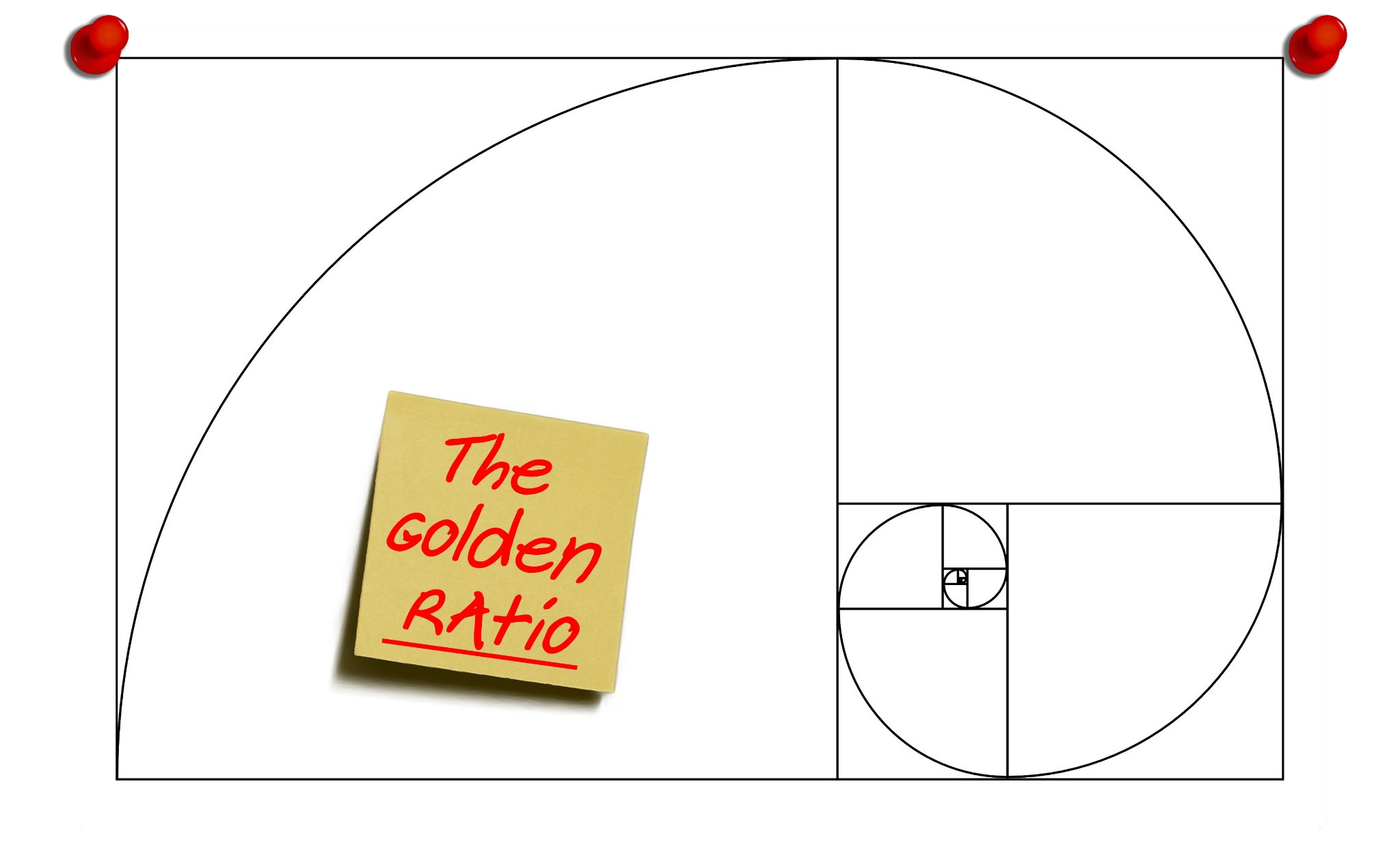
Composition plays a significant role in directing the viewer’s attention. Techniques such as the golden ratio can help position important subjects and create a natural visual flow.
Rather than placing the main subject directly in the centre every time, consider how the viewer’s eye travels through the illustration. A character looking towards another element, an object positioned along a diagonal or an environmental feature leading towards the focal point can all help create a more engaging composition.
However, following compositional rules is not enough by itself.
Artwork can have excellent subject placement and still be unsuitable for a card if it is too visually busy. Pokémon Chien-Pao example to demonstrate this. Although the action is positioned effectively, the complexity of the illustration makes the card’s text difficult to read.
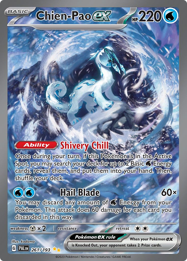
The lesson is simple: the illustration should make an impact without competing with the information surrounding it.
Establishing a clear focal point
Every card illustration benefits from a recognisable focal point. This might be a character’s face, a distinctive object, a dramatic action or an environmental feature.
A useful approach is to establish a hierarchy:
- Primary subject: The character, creature or object the player should notice first.
- Secondary elements: Supporting details that provide context and atmosphere.
- Background: Environmental storytelling that gives the illustration depth without overpowering the subject.
This hierarchy becomes especially important when the illustration has to share space with card names, abilities, statistics and resource indicators.
A good test is to reduce the illustration to thumbnail size. If the main subject is still immediately recognisable, the composition is probably working.
2. Understanding card sizes, layouts and aspect ratios
Different trading card games use different physical dimensions and approaches to presenting information.
Traditional games such as Yu-Gi-Oh! and Magic: The Gathering use established card dimensions and structured layouts. These designs give gameplay information a prominent position, with artwork occupying a defined section of the card.
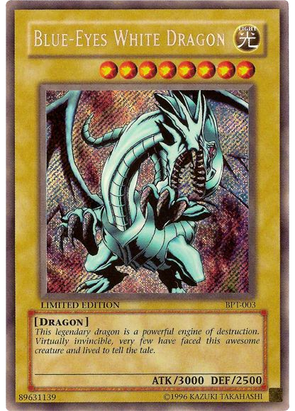
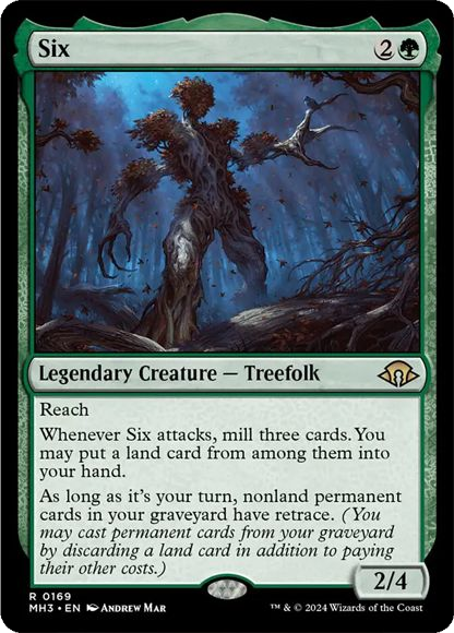
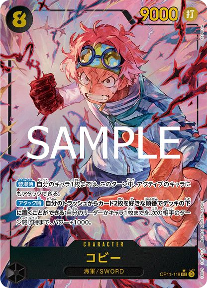
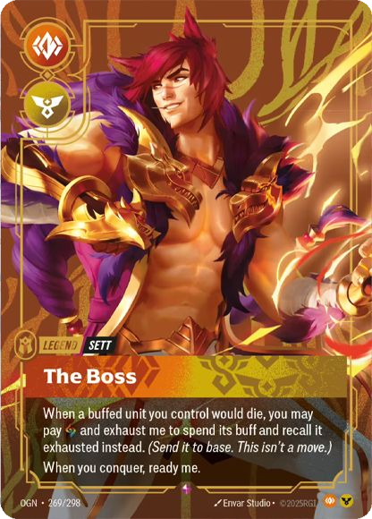
More recent games increasingly experiment with full-art cards, where the illustration extends across most or all of the available space. This allows the artwork to communicate more of the game’s world and creates opportunities for environmental storytelling.
Neither approach is inherently better. The right choice depends on the game’s identity and how much information players need to access during play.
For a world-building-focused game, full-art cards can be particularly effective. Each card becomes an opportunity to show another location, character or moment from the wider universe.
The TUN35 prototype explored this approach, aiming to use card illustrations to showcase the world rather than treating artwork as a separate decorative panel.
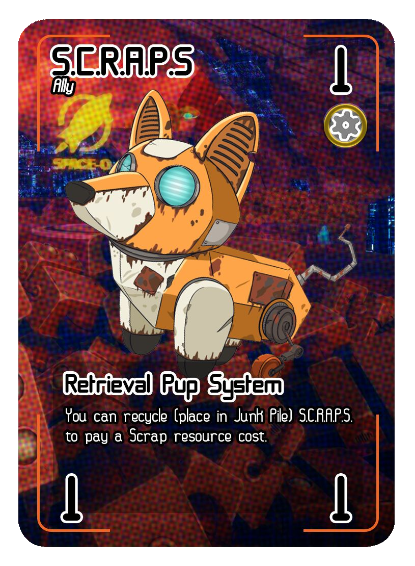
Planning the artwork around the template
Before starting an illustration, establish the card’s dimensions and layout.
Consider:
- Where the title will appear.
- How much space is required for rules text.
- Where statistics and resource icons will sit.
- Whether the card uses a full-art or boxed illustration.
- Which areas must remain visually quiet.
- Whether any artwork will be obscured by interface elements.
These decisions should influence the composition from the beginning.
An illustrator should not have to finish an image only to discover that the character’s face sits underneath a title bar or that an important part of the scene is hidden behind the rules text.
3. Preparing artwork for print
Creating artwork for a digital prototype is different from preparing artwork for physical production. Print specifications need to be considered early, rather than treated as a final technical adjustment.
You should be working at 300 DPI and provides the following example specifications for a standard-sized card.
| Specification | Dimensions |
|---|---|
| Finished card size | 63 × 88 mm |
| Bleed | 3 mm |
| Artwork including bleed | Approximately 815 × 1110 px |
| Artwork without bleed | Approximately 750 × 1045 px |
| Resolution | 300 DPI |
These figures are useful starting points, although the final production template should always come from the printer.
Bleed and safe areas
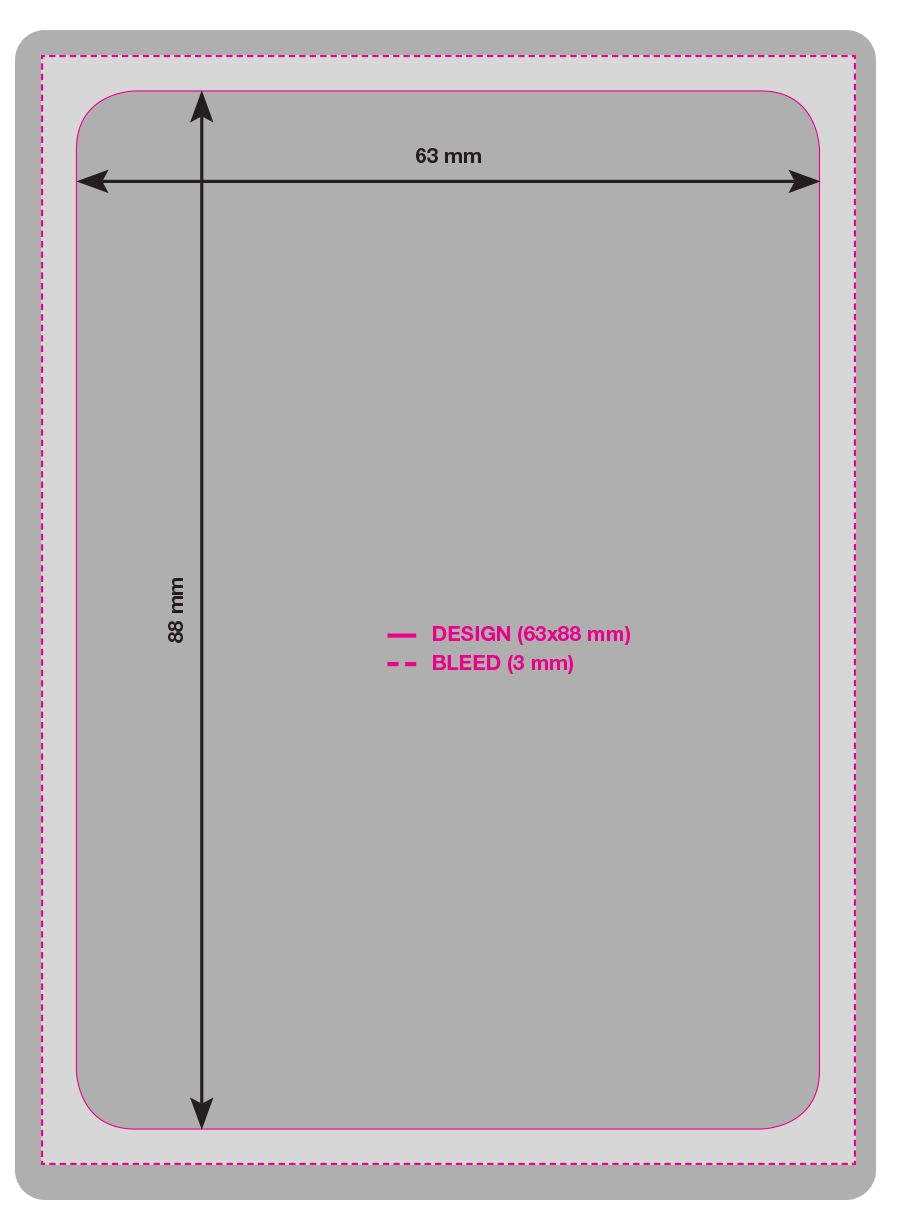
Bleed is the extra artwork extending beyond the finished card’s cutting boundary. It allows for small inaccuracies during printing and trimming.
Without bleed, even a slight shift in the cutting position could expose an unwanted white edge.
The safe area is different. This is the region inside the trim boundary where important content should remain.
Keep essential elements such as:
- Character faces.
- Card titles.
- Rules text.
- Resource symbols.
- Important visual details.
away from the cutting edges.
Background colours, textures and environmental artwork can extend into the bleed, but critical information should never depend on surviving a precise cut.
Work at the actual card size
A common mistake is to judge artwork entirely while zoomed in on a large screen.
When designing cards, regularly view the artwork at its intended physical size. Details that look impressive at 200% zoom might become indistinguishable when printed.
Check that characters remain readable, small details do not become visual noise and important elements retain enough contrast.
It is also worth printing test cards. A physical prototype can reveal problems with legibility, colour, scale and spacing that are easy to overlook on a monitor.
4. Making artwork work with card UI
Card UI, or user interface, is the system of visual elements that communicates the card’s identity and gameplay information.
This includes titles, numbers, resource costs, ability descriptions, icons, borders, frames and other indicators.
The challenge is to make these elements feel like part of the card rather than objects placed over an illustration as an afterthought.
Creating a visual hierarchy
Players should be able to understand the important parts of a card quickly.
A typical hierarchy might look like this:
- Card identity: Name, character or location.
- Primary artwork: The main visual subject.
- Gameplay statistics: Attack, health, cost or other numerical values.
- Abilities: Rules text and special effects.
- Supporting information: Artist credits, collection numbers and additional symbols.
The exact order will depend on the game, but consistency is essential.
If every card places its title, statistics and abilities in predictable locations, players can learn the interface and navigate cards more quickly.
Typography and readability
Typography is one of the most important parts of card UI.
A typeface might look perfect for a science-fiction title, but that does not necessarily make it suitable for several paragraphs of rules text.
It is useful to distinguish between display typography and functional typography.
Display fonts can establish personality through card names, headings and faction identities. Functional fonts should prioritise readability, especially when describing complicated abilities.
Pay attention to:
- Font size at the physical print dimensions.
- Letter spacing and line spacing.
- Contrast between text and background.
- Consistent alignment.
- Clear distinctions between headings and descriptions.
- Enough room for longer ability text.
Avoid placing complex text directly over detailed illustrations. A subtle darkened panel, gradient or translucent background can make a substantial difference.
The goal is not to remove the artwork from the card, but to ensure that gameplay information remains accessible.
Icons and resource indicators
Icons allow players to recognise information without having to read everything.
A well-designed resource icon should be distinctive, recognisable at a small size and consistent throughout the game.
Resource indicators should also be positioned predictably. Players should not have to search different areas of each card to find its cost or resource requirements.
The same applies to statistics and numerical values. Their visual treatment should communicate their function clearly.
5. Building a consistent card design system
Individual cards need personality, but the overall collection needs consistency.
A TCG benefits from having an established visual design system that defines how cards are constructed.
This might include:
- Standardised card dimensions and corner treatments.
- Consistent title and subtitle positioning.
- A defined typography system.
- Standard resource and statistic locations.
- Reusable UI panels and frames.
- Consistent icon sizes and line weights.
- A controlled colour palette.
- Rules for spacing and alignment.
Once these foundations are established, different card types can introduce their own visual variations without making the game feel fragmented.
For example, a planet card might use a different background treatment from a character card, while retaining the same typography, border language and resource positioning.
This creates a recognisable visual identity across the entire game.
6. Using artwork in different ways
Artwork created for trading cards does not have to be limited to a single card. With some planning, one illustration can support multiple products and provide additional storytelling opportunities.
Using existing illustrations
Not every illustration needs to be created specifically for a trading card.
An existing image can sometimes be adapted successfully if its main subject and action remain visible once the card’s UI is applied.
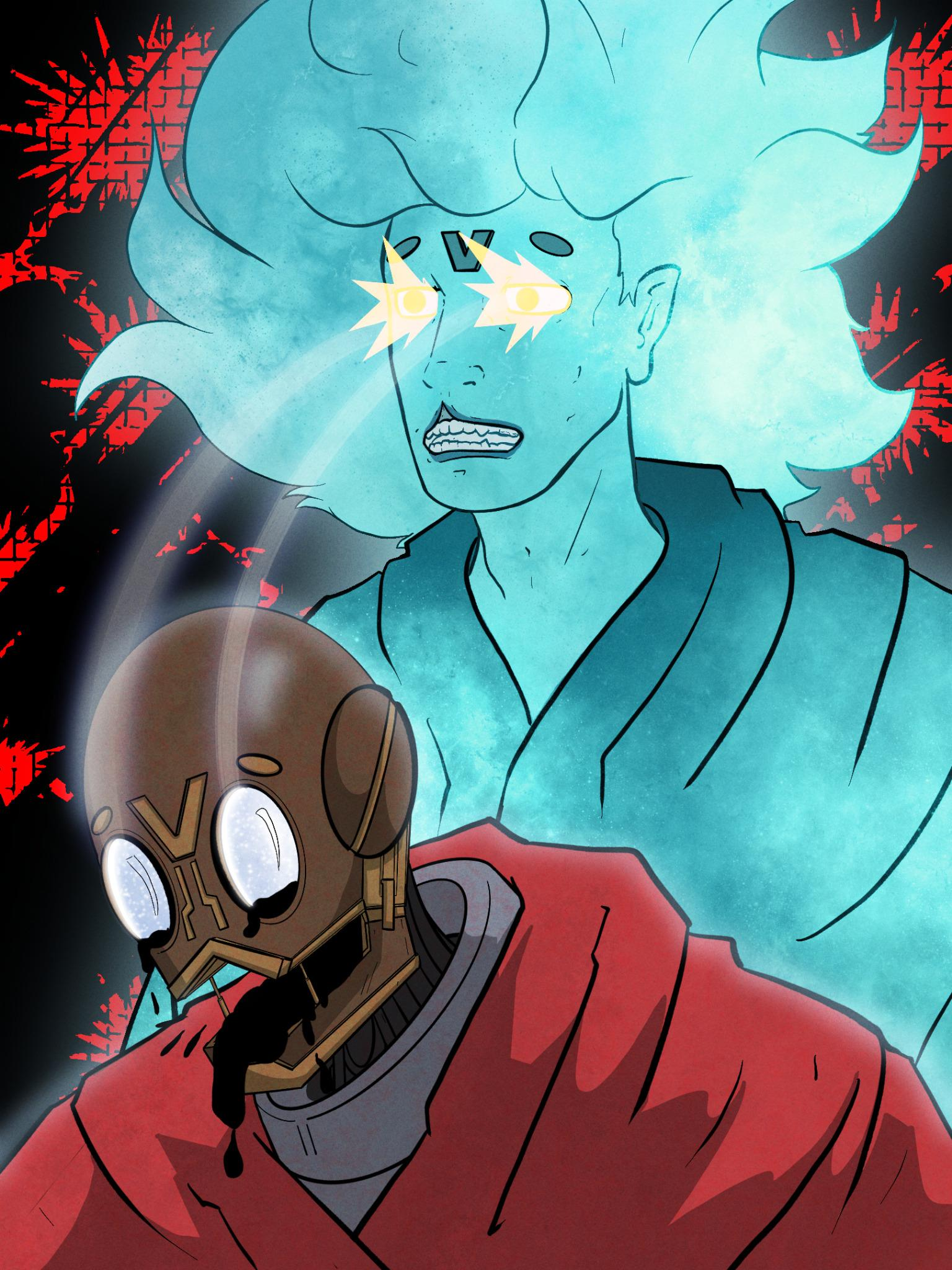
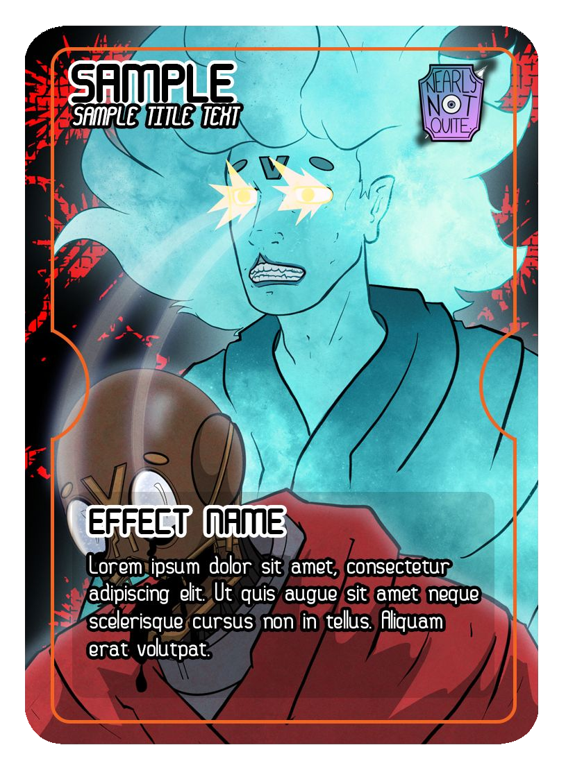
The key consideration is whether the focal point survives the addition of game elements.
Reframing existing artwork
Sometimes an existing illustration contains more information than the card actually needs.
Instead of redesigning the entire image, it can be reframed or cropped to suit the card’s dimensions.
This is particularly useful when the original artwork was created for promotional material, character illustrations or other media.
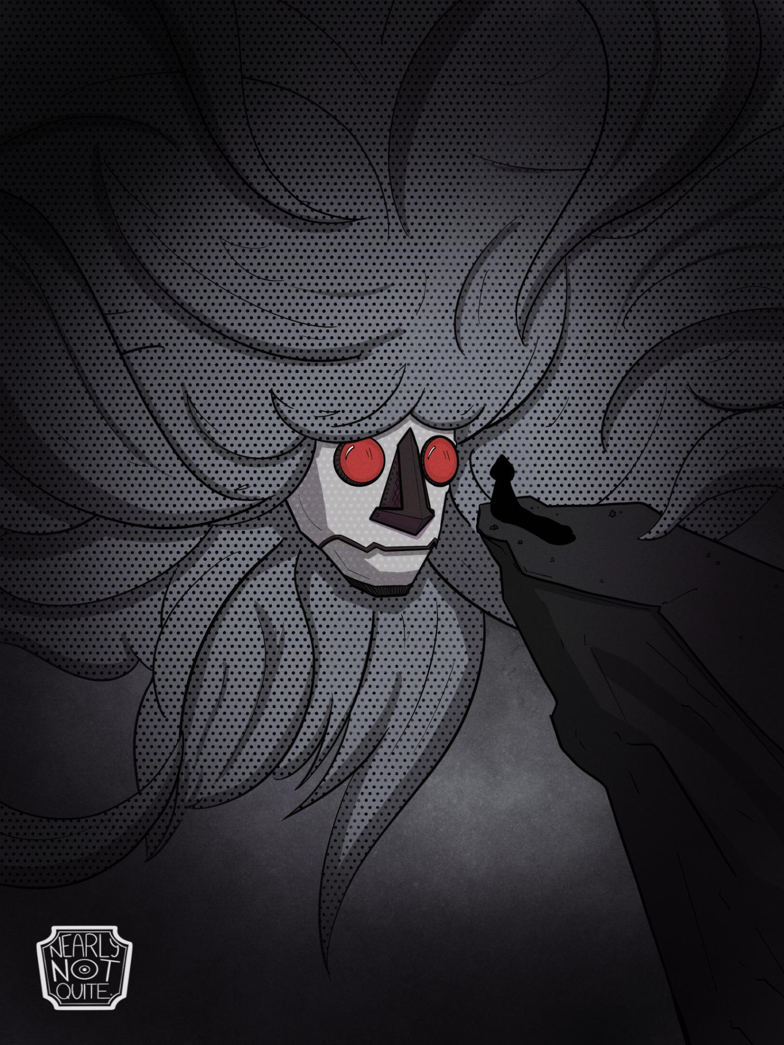
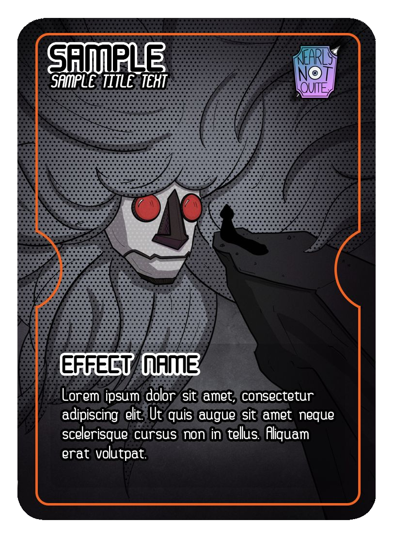
The original composition can be retained for promotional purposes, while a revised crop becomes the card illustration.
This approach also allows artwork to be reused without every application looking identical.
Creating artwork across multiple cards
One of the most interesting possibilities is designing a larger illustration that can be divided across multiple cards.
When placed together, the cards form a continuous image.
This technique creates an additional layer of visual storytelling. Individual cards still function independently, but collecting or placing them together reveals a larger scene.
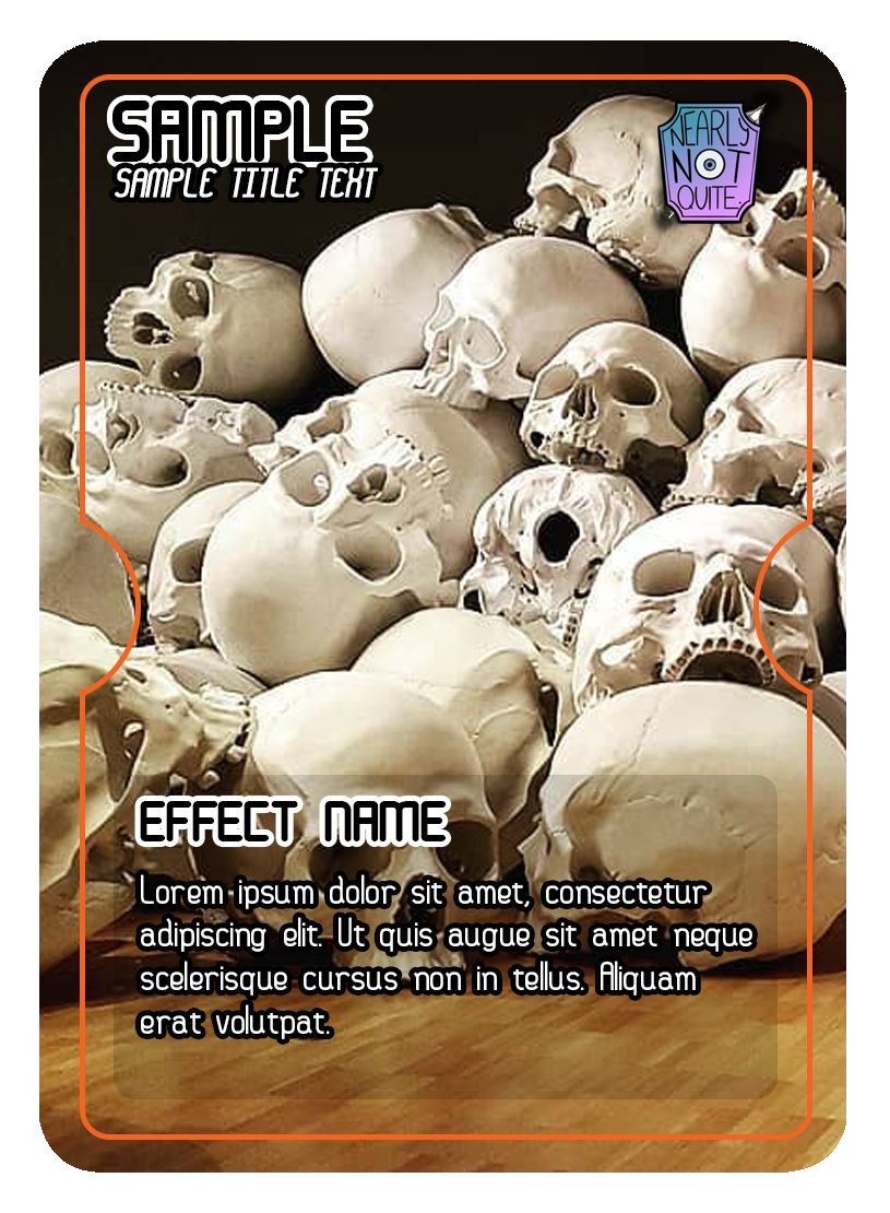
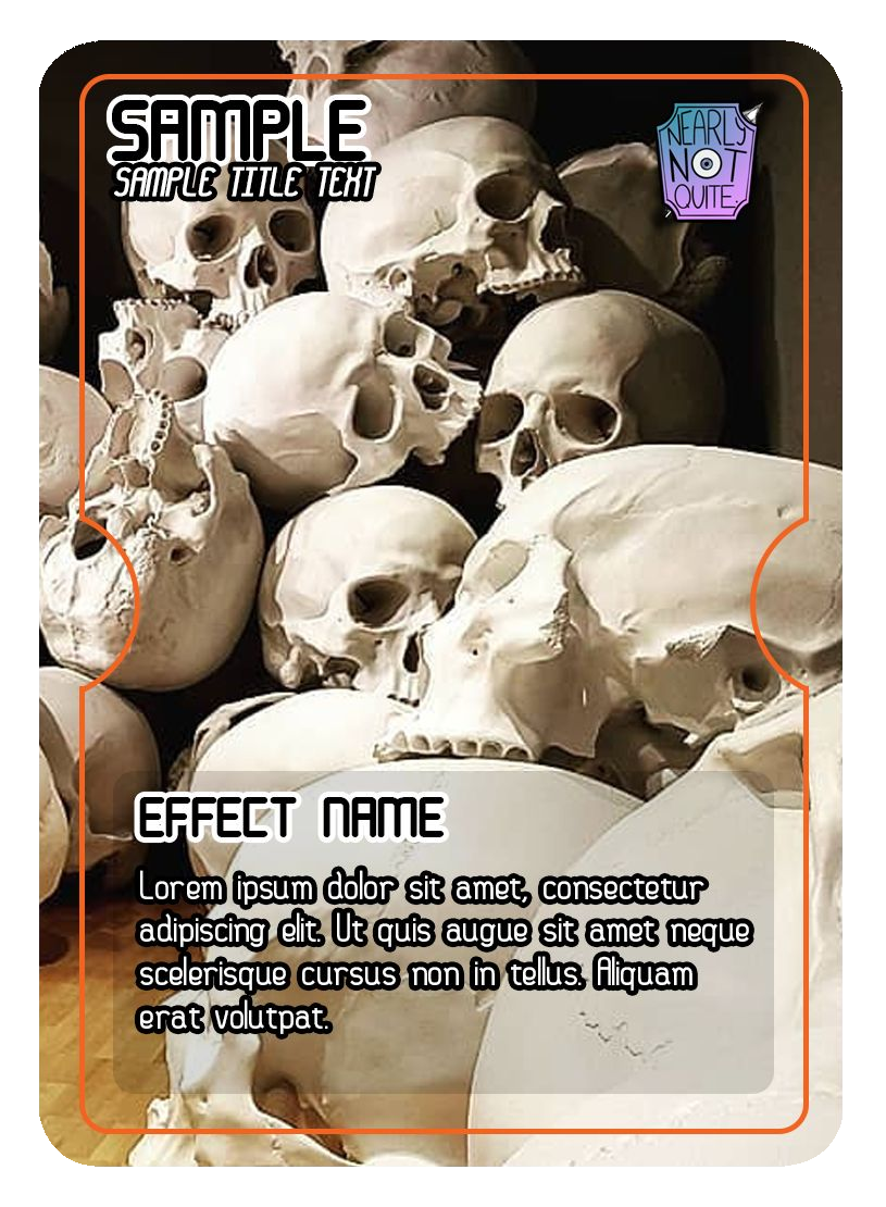
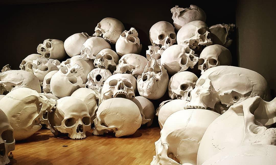
This approach can also create opportunities for promotional artwork, playmats and other accessories, allowing one larger illustration to support several parts of a game’s visual identity.
7. Applying these principles to TUN35 card design
The four example cards provide a useful demonstration of how illustration and UI can work together across different card categories.
Rather than using one identical visual treatment for every type of card, they adapt the presentation to suit the subject and the information being communicated.
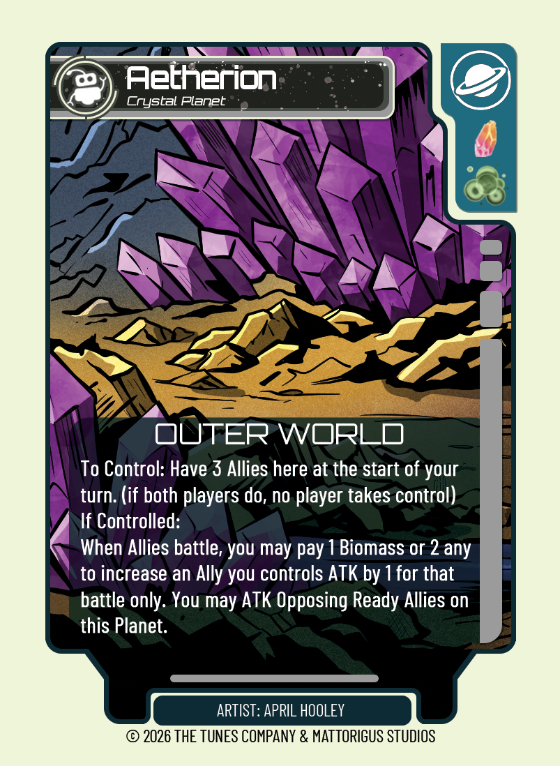
Aetherion: Crystal Planet
The Aetherion card uses a dramatic environmental illustration, with large purple crystal formations dominating the background and a golden rocky landscape establishing the foreground.
The composition gives the location a strong identity. The crystals provide the main visual impact, while the contrasting ground creates depth and helps distinguish the different layers of the environment.
The card also demonstrates how a full-art location illustration can coexist with substantial rules text.
The dark lower panel creates a dedicated reading area, separating gameplay information from the more complex illustration.
This is particularly effective for location cards, where the environment itself is the main subject and the card’s rules may require a longer description.
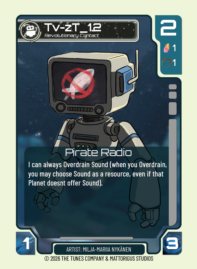
TV-ZT: Revolutionary Contact
TV-ZT uses a character-focused composition, placing a distinctive robot against a dark, atmospheric background.
The robot’s screen, antenna and mechanical features make it immediately recognisable. Its light body also contrasts with the darker surroundings.
The card demonstrates the importance of designing a character that remains readable at card scale.
Its rules text sits within a translucent lower panel, allowing the illustration to remain visible while providing enough contrast for the ability description.
The resource and numerical indicators are separated into dedicated UI areas, creating a clear distinction between the artwork and the information players need during a game.
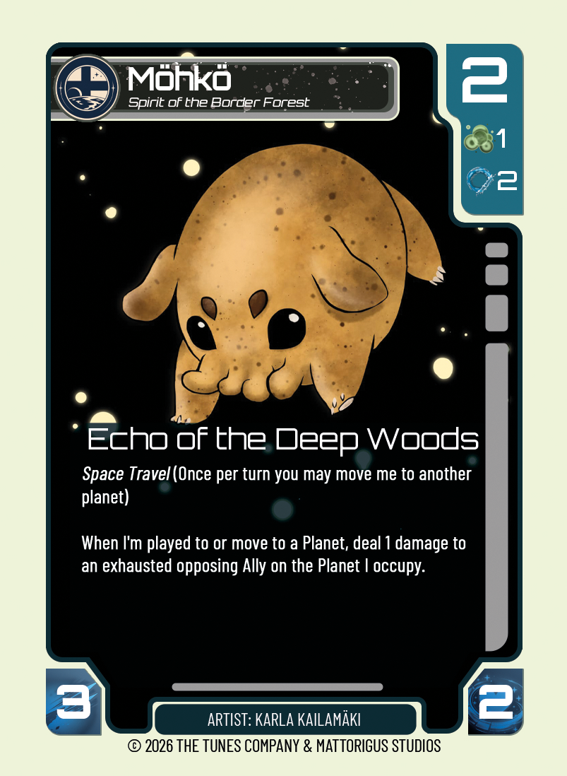
Möhkö: Spirit of the Border Forest
Möhkö takes a different approach by using a creature illustration against a largely black, star-filled environment.
The warm golden colour of the creature immediately draws attention, while the surrounding negative space gives the subject room to breathe.
This is a useful example of how an illustration does not always need a complicated background to feel complete.
The creature’s silhouette and expression do most of the storytelling.
The rules information is positioned beneath the character, with enough separation to avoid competing with the focal point.
The overall presentation gives Möhkö a distinctive identity while maintaining the same general card framework.
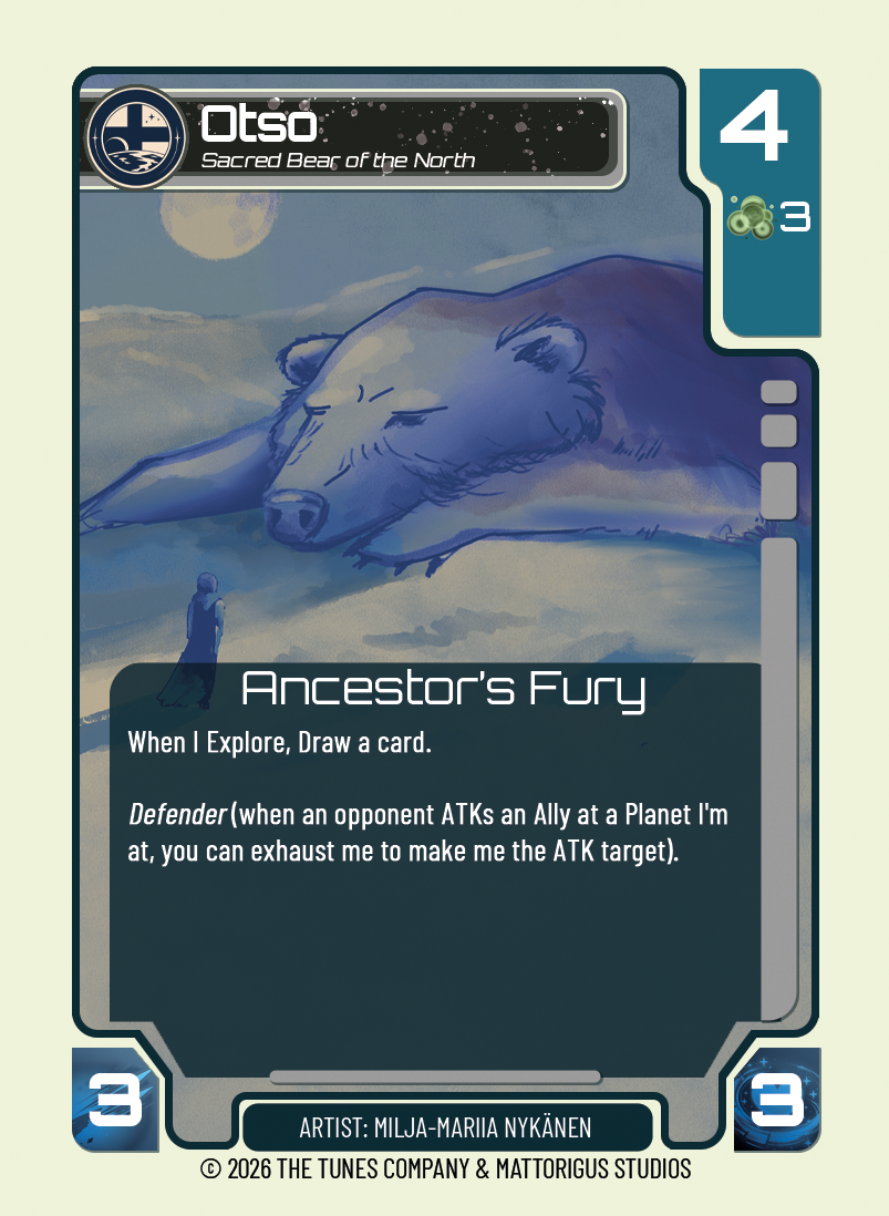
Otso: Sacred Bear of the North
Otso uses a softer, more atmospheric illustration.
The enormous bear occupies much of the composition, while the smaller figure in the foreground establishes scale and suggests a relationship between the creature and the surrounding world.
The muted blue palette creates a different emotional tone from the more vibrant Aetherion and TV-ZT cards.
This demonstrates how colour and composition can communicate a card’s identity before the player even reads its name.
The rules panel is integrated into the lower portion of the image, maintaining a clear reading area without losing the atmosphere of the original illustration.
Together, these four examples demonstrate how different subjects can have their own artistic personalities while still belonging to the same game.
8. A practical workflow for creating TCG cards
A reliable process helps prevent artistic and technical decisions from conflicting later in development.
A useful workflow is:
Step 1: Establish the card’s purpose
Decide what the card represents and what information it needs to communicate. A character, planet, item and event card may each require a different compositional approach.
Step 2: Set up the card template
Establish the physical dimensions, bleed, safe areas and UI layout before beginning the final artwork.
Step 3: Develop the composition
Create sketches and thumbnails that account for the title, statistics, resource icons and rules text. Establish the focal point and make sure it remains visible.
Step 4: Create the illustration
Develop the artwork with the card’s final presentation in mind. Consider contrast, colour, background detail and how the image will look when reduced to print size.
Step 5: Apply the UI
Introduce the title, statistics, icons, text panels and other interface elements. Check that they feel integrated with the illustration.
Step 6: Test readability
View the card at its actual size. Check the smallest text, icon clarity, visual hierarchy and contrast.
Step 7: Prepare the print file
Check resolution, dimensions, bleed and safe areas. Follow the printer’s specifications and export the final artwork accordingly.
Step 8: Review the complete card collection
Look at several cards together. Check that the visual language is consistent, that individual cards remain distinctive and that the overall collection feels like one coherent game.
Conclusion: Art and UI should work together
The strongest trading card designs understand that artwork and interface are not competing elements. They are two parts of the same experience.
The illustration gives a card personality, atmosphere and a place within the game’s universe. The UI gives it structure, identity and functionality.
A beautiful illustration can lose its impact if important details are hidden or the rules text is difficult to read. Equally, a perfectly organised interface can feel lifeless if the artwork lacks character.
The aim is to find the balance between the two.
By considering composition, physical dimensions, print requirements, typography, iconography and information hierarchy from the beginning, artists and designers can create cards that look compelling, function clearly and contribute to a consistent visual world.
Every card is an opportunity to tell a story, communicate a mechanic and give players another reason to engage with the universe they are exploring.
Download the original Making Art For Trading Cards guide (PDF)