| Project | TUN35 Trading Card Game |
|---|---|
| Studio | Harakka |
| Role | Creative Director, Lead Designer & Illustrator |
| Disciplines | Illustration, Card Design, UI Design, Art Direction |
| Scope | Majority of the prototype card artwork, card UI system, print-ready assets, artist guide |
| Status | Prototype completed, commercial release discontinued |
The TUN35 Trading Card Game expanded the TUN35 video game universe into a strategic tabletop experience with four distinct factions. Alongside leading the game design, I produced the majority of the prototype card artwork and designed the card UI system.
TUN35 is a narrative-driven video game about a small mining robot working for the Space-O corporation, who finds freedom and an identity beyond its corporate purpose through an unexpected discovery of music.
The objective was to establish a visual language that felt authentic to TUN35 while making the game readable and functional as a physical trading card game. This case study focuses on the artwork and card design. For the game design, see the main TUN35 case study.
A Visual Language for Four Factions
The visual system needed to accommodate four factions with very different personalities while retaining a consistent overall identity. Each faction received its own thematic direction, with shared UI conventions ensuring players could quickly understand and navigate the cards.
Robot Uprising
Rebellion · Cooperation · Technological Advancement
TUN35 and the allied robots fighting to break free from Space-O’s corporate control.

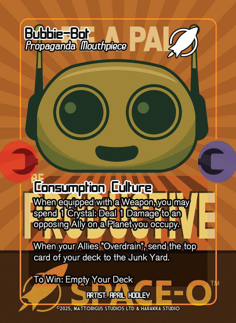
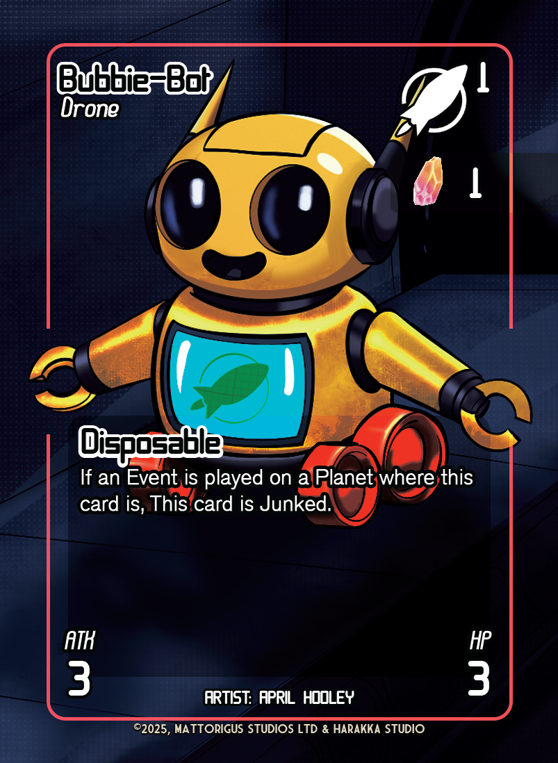
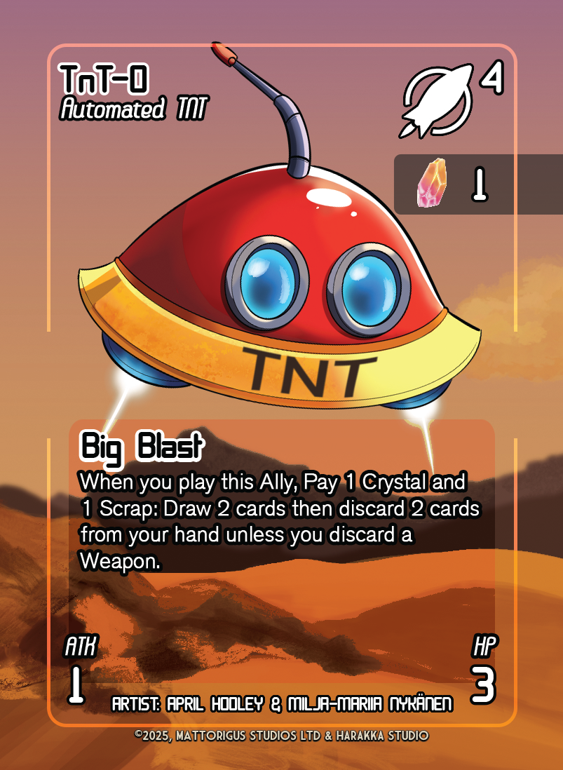
Space-O
Exploitation · Greed · Risk Management
A corporate force driven by resource extraction, stripping planets of valuable materials in the name of Earth’s survival. Bubbie-Bot, the character I voiced in the TUN35 universe, belongs here.
Suomenmaa
Exploration · Resilience · Adaptation
A futuristic Finnish civilisation specialising in survival and settlement across harsh planetary environments. I also supported the development of Suomenmaa’s lore.

Grubbers
Restoration · Recycling · Transformation
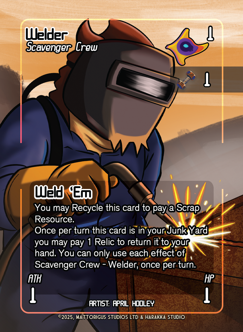
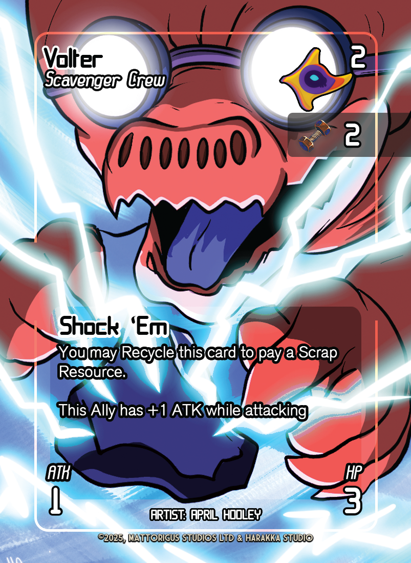
Pacifist alien salvagers who restore worlds devastated by Space-O’s industrial exploitation. I contributed to the character design and visual development of the Grubbers, helping establish a distinct identity for the faction.
Planets, Protagonists & the Playing Field
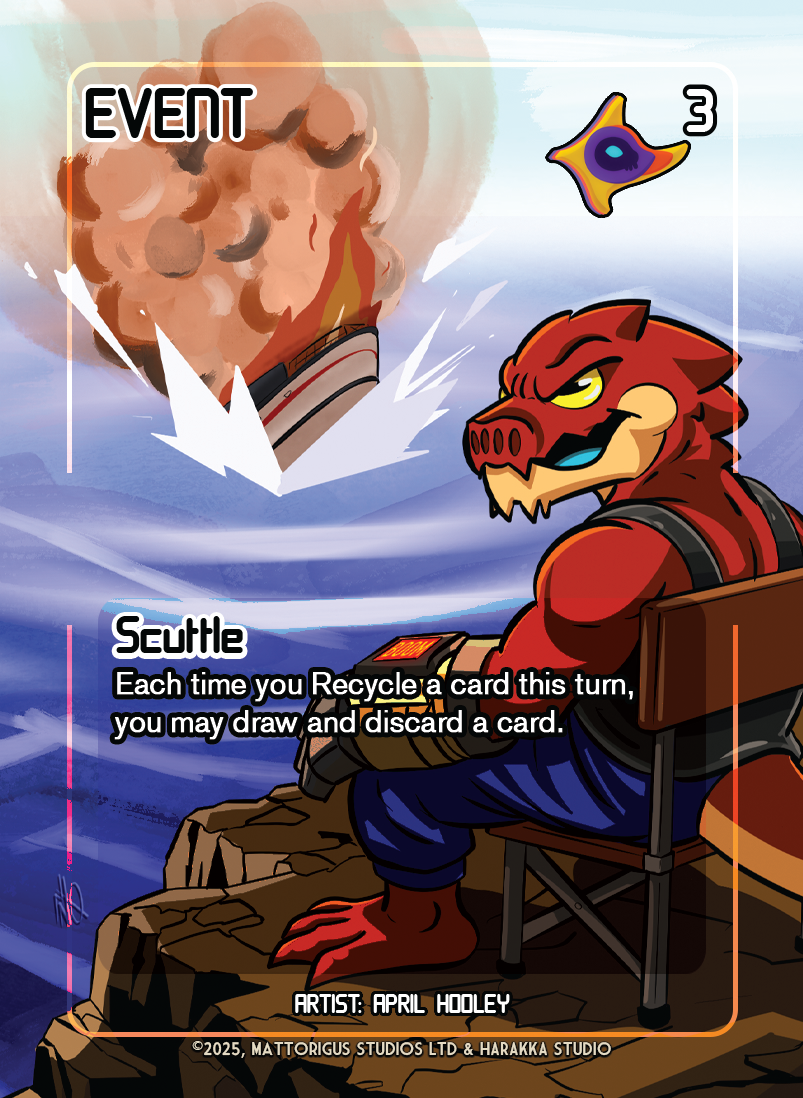
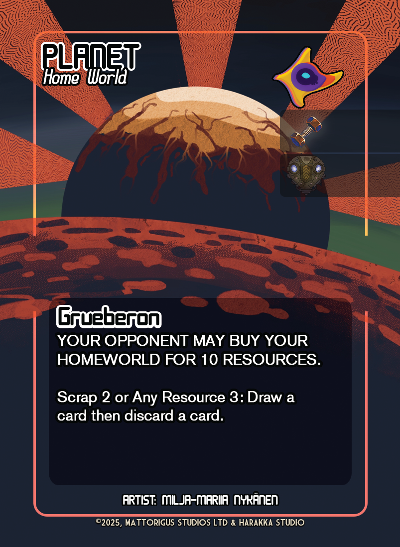
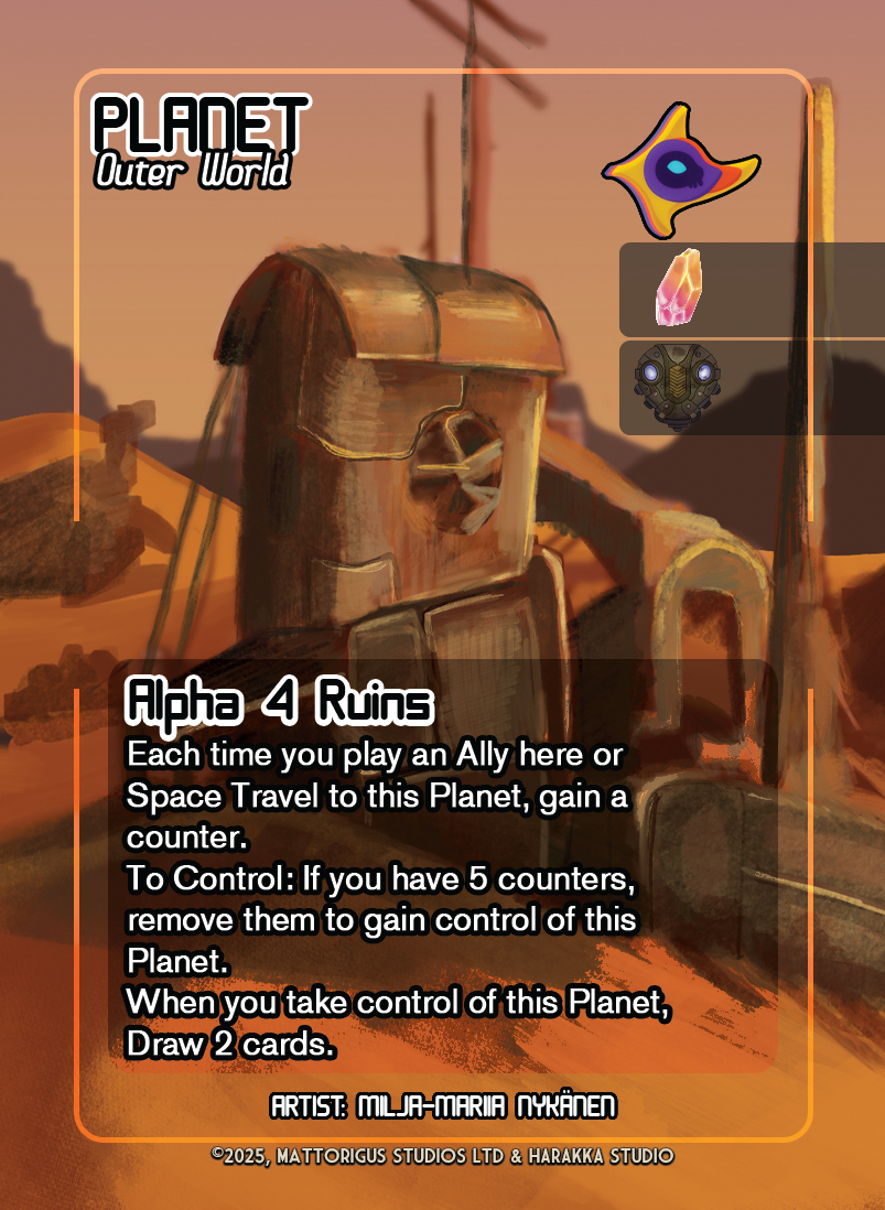
Beyond the faction characters, the artwork had to cover planets, allies, events and protagonists, each a different card category with different information to communicate.


Designing the Card UI
I developed the card UI system with both the aesthetic presentation and the practical requirements of gameplay in mind. This included:
- Card layout and information hierarchy.
- Visual systems for faction identification.
- Presentation of gameplay statistics, abilities and resource information.
- Visual consistency across different card categories.
- Preparation of print-ready files for physical prototyping.
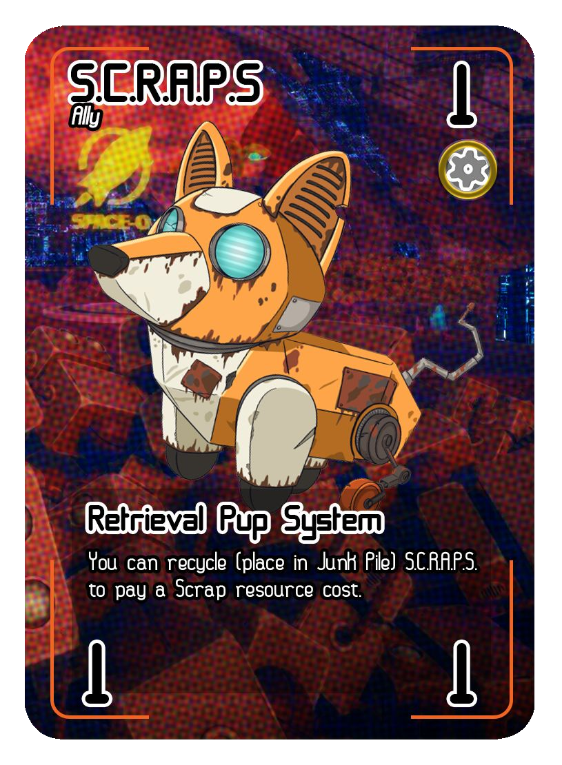
Art and UI Working Together
Rather than using one identical visual treatment for every type of card, the designs adapt the presentation to suit the subject and the information being communicated.
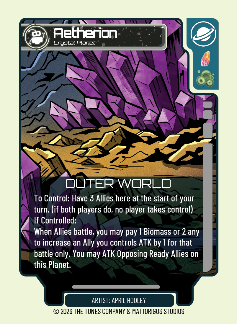
- Aetherion: Crystal Planet uses a dramatic environmental illustration, with a dark lower panel creating a dedicated reading area for longer rules text.
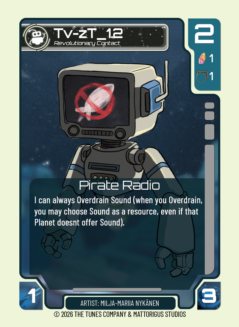
- TV-ZT: Revolutionary Contact places a distinctive robot against a dark background, designed to stay readable at card scale, with its rules in a translucent panel.
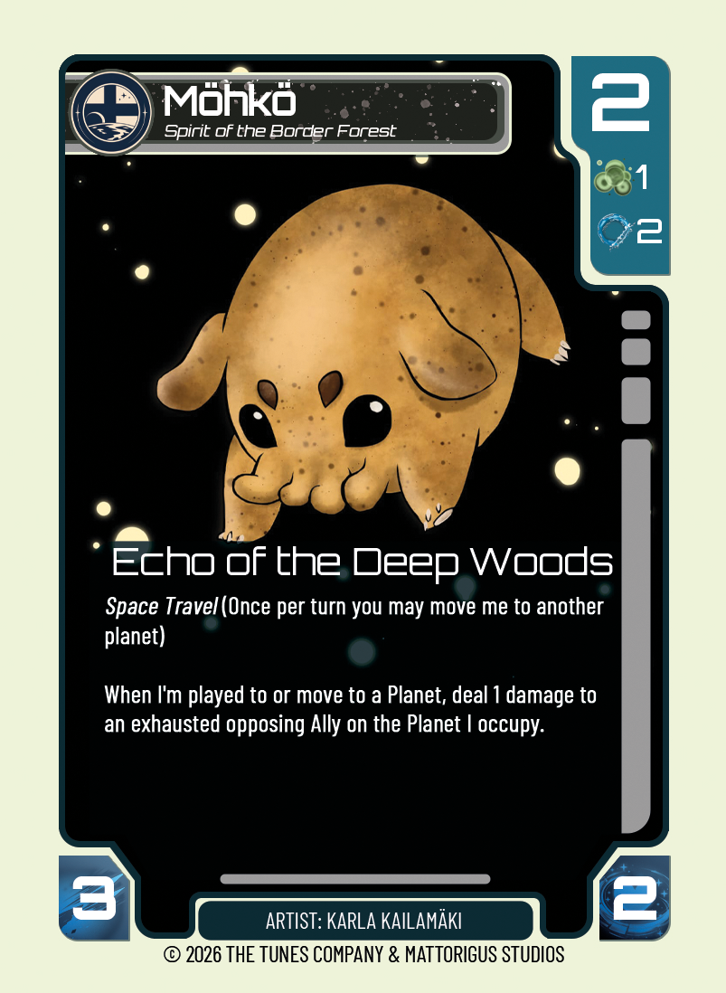
- Möhkö: Spirit of the Border Forest sets a warm golden creature against a star-filled black, letting negative space and silhouette do the storytelling.
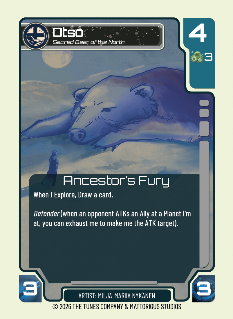
- Otso: Sacred Bear of the North uses a softer blue palette and a small foreground figure to establish scale and a different emotional tone.
Together, these show how different subjects can have their own artistic personalities while still belonging to the same game.
Supporting the Artist Community
I also created an educational slide pack, Making Art For Trading Cards, to introduce artists to the requirements and creative opportunities of trading card illustration, including the visual direction and thematic expectations for each faction.
This was an important part of establishing a production pipeline, making it easier to onboard additional artists and keep a cohesive visual identity as the card library expanded. Download Making Art For Trading Cards (PDF), or read the blog post version.
Outcome
The four initial faction decks were developed into playable, print-ready prototypes, and the project was preparing for a larger playtest reveal session in Finland. However, Harakka subsequently went bankrupt, bringing the planned commercial development to an end.
The artwork, card UI and artist guide remain a record of how the TUN35 universe could work as a physical card game, and the underlying engine continues as Mattorigus Studios’ Galaxy Engine.
Reflection
Illustrating cards is different from illustrating for its own sake. Every piece had to work at card scale, leave room for rules and statistics, and tell players which faction it belonged to at a glance.
Designing the artwork and the UI together meant those decisions could support each other, and writing the artist guide helped me put into words the principles I’d been working by.