| Project | Robot Raiders |
|---|---|
| Studio | Mattorigus Studios |
| Role | Creative Director & Illustrator |
| Disciplines | Illustration, Digital Painting, Character Design, Art Direction |
| Scope | Character concepts, card illustrations, style guides, external illustration pipeline |
| Collaborators | Little Devil Company |
| Status | Physical release discontinued, digital version currently in development |
Robot Raiders is a fantasy-themed, asymmetrical strategy game developed by Mattorigus Studios. Alongside leading its creative direction, I worked across character concepts, card illustrations and visual development, and directed the wider illustration process.
The artwork needed to do more than make individual cards look attractive. Each character had to communicate personality, role and place within the wider game world, and the whole product had to feel like a premium trading card game.
This case study focuses on illustration and art direction. For the full project, see the main Robot Raiders case study.
Never Sci-Fi. Always Fantasy.
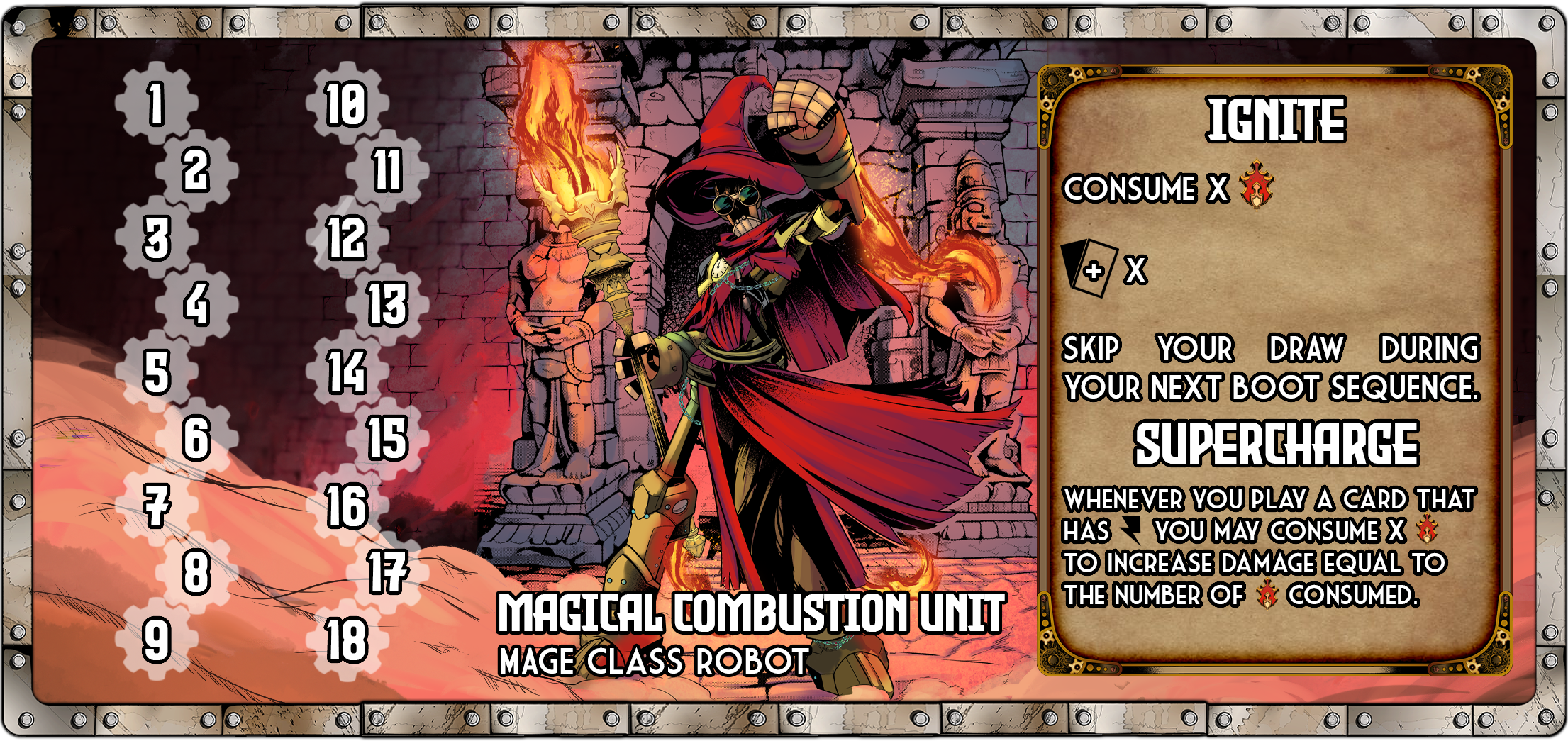
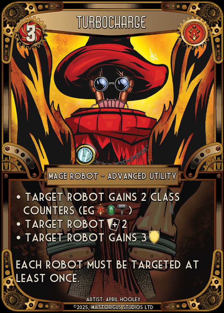
The first major character design was the Mage Robot, a mechanical character wearing an oversized mage’s hat. It established the creative principle that guided all of the artwork that followed:
Never sci-fi. Always fantasy.
Rather than treating the robotic characters as traditional science fiction machines, we wanted a world where fantasy archetypes and mechanical characters naturally coexisted, with strong character artwork and recognisable silhouettes.


The Original Painterly Direction
The original creative direction leaned towards darker, more painterly fantasy illustration, taking inspiration from the visual language of games such as Magic: The Gathering.
I researched independent artists through ArtStation to find illustrators capable of delivering that vision. The direction was explored through alternate artwork created exclusively for crowdfunding backers.


However, working with individual freelance artists presented production challenges. We needed a reliable pipeline that could deliver a consistent volume of artwork within the constraints of an independent studio, and we maintained a strict no-AI-generated-content policy, so finding the right creative partners was essential.
Working with Little Devil Company
This led us to Little Devil Company, an illustration studio based in Brazil. Their interpretation of the original character designs shifted the visual direction towards a more expressive comic-book aesthetic, with strong parallels to 1990s anime and series such as Medabots.
Rather than treating this as a departure from the original vision, I worked with the studio to develop it into a cohesive visual identity. The revised direction tested well with players, helping create excitement around the characters and their world.
The collaboration gave us a more scalable approach to illustration, combining external creative production with internal art direction, and a foundation for expanding the card library while keeping a recognisable style.
Painting the Cards
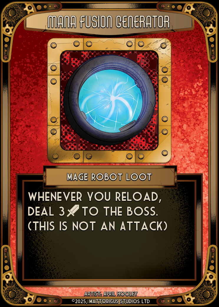
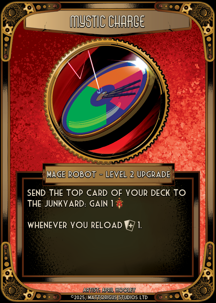
My own contributions included digitally painting numerous cards for the planned physical version, alongside developing the visual language used throughout the product.


I directed the wider illustration process to keep internal and commissioned artwork consistent, so that every card felt like it belonged to the same world.
Lore & Style Guides
We collaborated with artists and volunteers to establish character lore, visual guidelines and a broader style guide. This ensured that new artwork contributed to a consistent world rather than existing as disconnected illustrations.
Character Splash Art
Character splash artwork introduced the world and its characters on the original Kickstarter page, bringing the art direction into the game’s marketing.


Into the Digital Version
Robot Raiders is now continuing as a digital game. The character designs, visual identity, commissioned artwork and established lore continue to inform its evolution, including a redesign of the Mage Robot’s board and cards.
Reflection
Robot Raiders taught me how to adapt a creative vision to the realities of independent production. The evolution from painterly fantasy to an expressive comic-book style could have felt like a compromise, but working closely with Little Devil Company turned it into a stronger, more recognisable identity.
Painting cards myself while directing other artists also showed me how important shared guidelines are. A style guide and a clear principle, never sci-fi, always fantasy, let many hands build one consistent world.